

Here’s a visual sit-rep on prices for Americans.
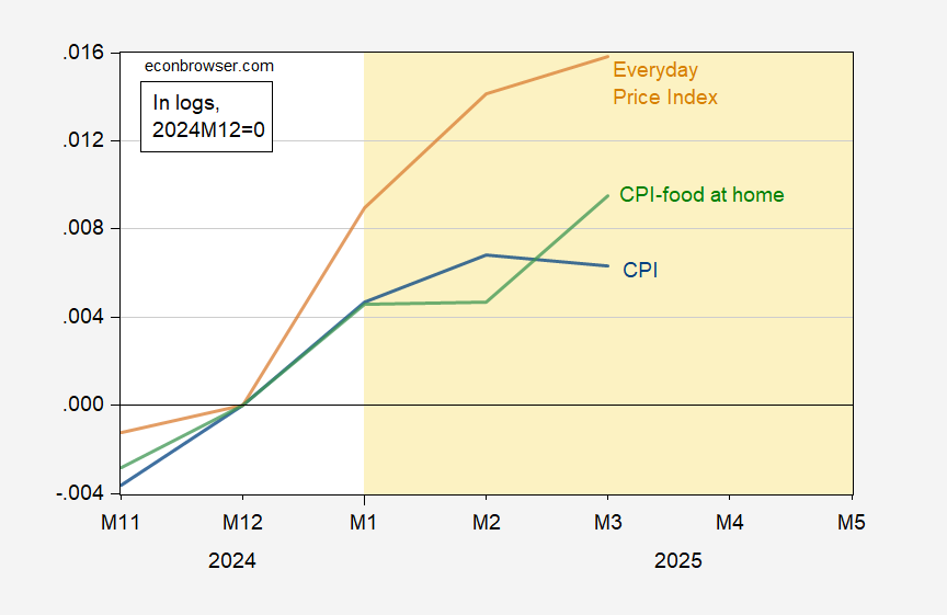
Figure 1: CPI – all urban (blue), CPI food at home (green), AIER Everyday Price Index (tan), all in logs 2024M12=0. Source: BLS, AIER, and author’s calculations.
It is interesting that the AIER’s Everyday Price Index, aimed at measuring the costs of nondeferrable expenses – has risen faster than the CPI.
The USDA Economic Research Service does not project a decline in food at home (aka groceries) prices.
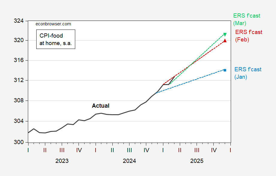
Figure 2: CPI for food at home (black), USDA Economic Research Service forecast from January (blue square), from February (red triangle), from March (green inverted triangle), on log scale. Source: BLS via FRED, ERS, author’s calculations.
Since Figure 2 is drawn with a vertical log scale, the steepening trajectories indicate upward revisions in the trajectory of prices.

 Credibility Lost? Bordo-Siklos 5 Year")


")

